Why Visual Storytelling Matters: The Impact of Data Visualization
Visual storytelling has emerged as a critical component in the digital age, especially when it comes to communicating complex ideas clearly and effectively. With the vast amount of data available today, it's essential to leverage data visualization techniques to transform overwhelming statistics into digestible visuals. Effective visuals not only enhance comprehension but also engage the audience's emotions and attention. According to a study from McKinsey, data visualization can improve decision-making by using graphical representations that are easier to interpret than traditional data formats.
Utilizing strong visual elements and storytelling principles, businesses can create compelling narratives that resonate with their audiences. This approach not only attracts attention but also fosters retention and understanding of critical information. By incorporating tools like infographics, interactive charts, and videos, organizations can amplify their message and reach wider audiences. A report from Harvard Business Review highlights that data visualization can lead to faster insights and more informed decisions. Ultimately, in a world inundated with information, mastering visual storytelling is essential for any brand looking to stand out and create lasting impact.
Transform Your Data: Key Techniques for Effective Visual Storytelling
In the era of data-driven decision-making, effective visual storytelling is essential for transforming complex data into digestible insights. One of the key techniques is to leverage data visualization tools that align with your narrative. Tools like Tableau and Power BI allow you to create dynamic visuals that not only enhance understanding but also engage your audience. Additionally, consider employing color theory to differentiate data categories and emphasize key points. Using a cohesive color palette helps in maintaining visual clarity, making it easier for viewers to follow the storyline.
Another crucial method in visual storytelling is the use of infographics, which combine graphics and text to simplify information. According to HubSpot's marketing statistics, people remember 80% of what they see and do, making infographics a powerful tool for audience retention. Ensure your infographic follows a logical flow, guiding the viewer through the data effortlessly. Lastly, incorporate interactive elements like charts or sliders to allow users to explore data at their own pace, enhancing engagement and fostering a deeper connection with the narrative.
The Power of Visualization: How to Make Data Speak Through Compelling Graphics
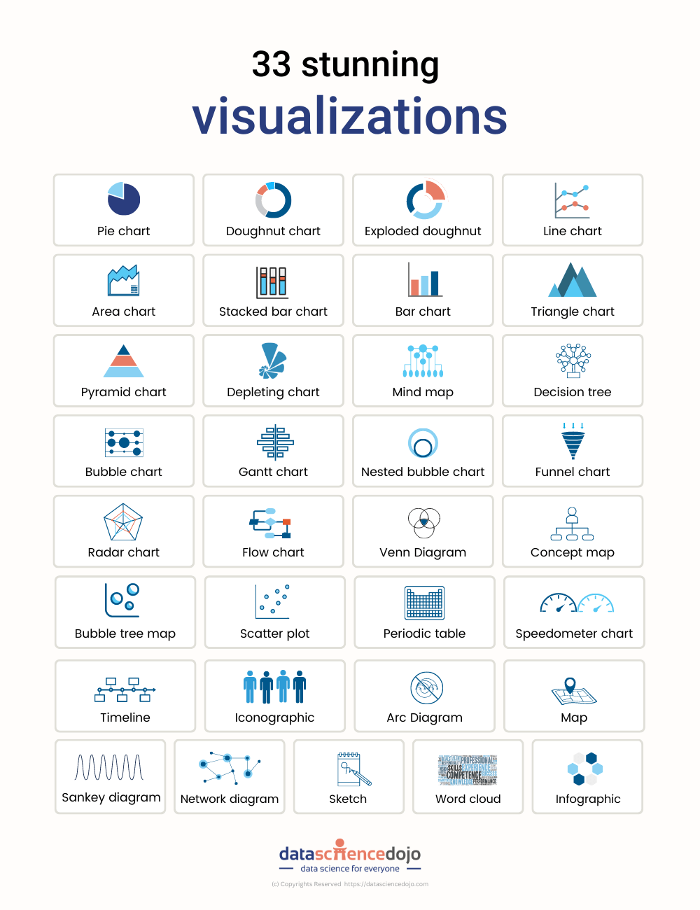
The power of visualization lies in its ability to transform complex data into easily digestible graphics. By using various forms of visual representation, such as charts, graphs, and infographics, you can effectively convey insights that might otherwise be overlooked. Visualization not only enhances the accessibility of data but also engages the audience, allowing for better retention and understanding. For instance, a well-designed pie chart can highlight demographic distributions more effectively than pages of text, making the information both memorable and impactful.
Moreover, compelling graphics can tell a story that resonates with the audience. By integrating data storytelling techniques, such as narrative elements alongside visuals, you can guide viewers through the insights you wish to highlight. This approach captivates your audience and influences their decision-making processes. In conclusion, harnessing the power of visualization not only enriches your content but also elevates the way data is perceived, driving engagement and enhancing comprehension.