The Art of Data Visualization: Turning Numbers into Narratives
The Art of Data Visualization is an essential skill in today’s information-driven world. Turning complex numbers into clear narratives allows audiences to grasp intricate data sets quickly and effectively. By utilizing visual elements such as charts, graphs, and infographics, data can be transformed into compelling stories that enhance understanding and retention. To create engaging visual content, it is crucial to focus on clarity and relevance, ensuring that the message resonates with the target audience.
Moreover, well-designed data visualizations can significantly influence decision-making processes. According to experts, the human brain processes visuals 60,000 times faster than text, making it vital to present data in a digestible format. Some techniques to consider for effective visualization include:
- Choosing the right type of chart for your data.
- Utilizing color and contrast to highlight key findings.
- Maintaining simplicity to avoid overwhelming the viewer.
Ultimately, mastering the art of data visualization enables content creators to tell powerful stories that inspire action and foster understanding.
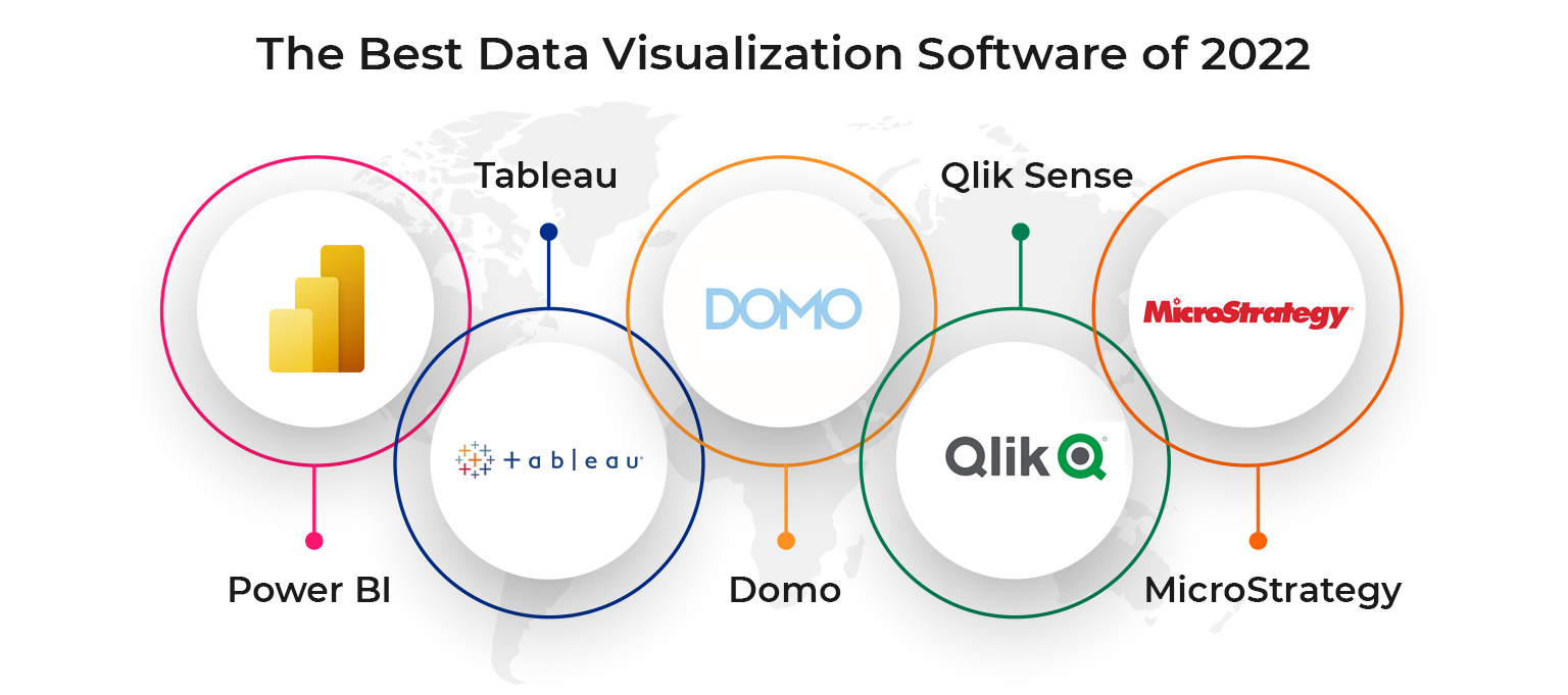
Top 5 Tools for Creating Stunning Visual Insights from Your Data
In today's data-driven world, the ability to create stunning visual insights from your data is crucial for effective communication and decision-making. Here, we highlight the Top 5 Tools that can help you turn raw data into compelling visuals. Each tool offers unique features designed to enhance your data storytelling and improve audience engagement. Whether you are a seasoned data analyst or a business owner looking to make sense of your metrics, these tools will elevate your visual presentation.
- Tableau: Known for its powerful visualization capabilities, Tableau helps users create interactive and shareable dashboards.
- Power BI: A Microsoft product that integrates seamlessly with other Microsoft services, Power BI allows users to visualize data and share insights across their organization.
- Google Data Studio: This free tool offers customizable reports and dashboards, making it easy to turn your data into informative visuals.
- Looker: Ideal for integrating with big data sources, Looker provides tools for exploring and customizable data applications.
- D3.js: For those with coding skills, D3.js offers flexibility and control to create dynamic and interactive data visualizations on the web.
How to Choose the Right Graph for Your Data Story
When it comes to choosing the right graph for your data story, it's essential to understand the type of data you are working with. Different graphs serve unique purposes and can convey information more effectively depending on the context. For instance, if you’re comparing categories, a bar chart would be suitable, while a line graph is excellent for showing trends over time. To simplify this process, consider the following key questions:
- What is the primary message I want to convey?
- How many variables am I comparing?
- What is the relationship between the data points?
Once you have a clear understanding of your data, it’s time to pick the most effective visualization. For instance, if your focus is to highlight proportions, a pie chart can be advantageous, but keep in mind that it’s not always the best choice for comparing similar values. On the other hand, if you have a large dataset with multiple variables, a scatter plot can reveal correlations that might not be apparent in simpler graphs. Remember, the ultimate goal of your graph is to enhance your data story and provide clarity to your audience.